Now let’s get into this century, when people transact business over the internet. They create and transmit art via the web, email specs, quantities, due dates, bindery instructions, etc. and receive PDF proofs uploaded to their computers and that is the problem. Color on your computer is comprised of luminescent color. More specifically, it’s pixels of Red/Green/Blue light, and what is going on in your computer is not the same as what is going on in someone else’s computer. It’s like looking at the bank of TV screens at Costco. The colors are all over the place, even though all the TVs are displaying the same content.
What’s the secret to proofing PMS colors?
Peggy Dent • May 11, 2020
What’s the secret to proofing PMS colors?
You would think, in a world where we can broadcast messages instantaneously to computers virtually anywhere on the planet, that we could figure out a way to remotely proof PMS colors, but proofing these colors has been a problem since the first printing company decided to print in a color other than black. Well maybe not that long, but as long as we’ve made Pantone Matching System (PMS) color choices available to print customers. The PMS system was originally intended to take the guess-work out of printing in color, but now that we work with vendors and clients all over the world, it has become much more difficult. (There are many color matching systems other than Pantone, but the issues are the same regardless of which system you’re using, so I’ll just focus on the PMS system, which is the most commonly used color system in the US).
If we all use the same standards and we all mix ink colors using the same PMS defined formulas, the color should be the same, every time, Right? If that is the case, then someone in Portland Oregon should be able to confidently communicate with a designer in Boston or San Francisco about a PMS colors and know they are all in agreement about the color choices. The Portland client and the Boston designer would be looking at the same thing on their computers and they would be able to have an intelligent conversation about the depth, tone intensity, darkness or brightness of the color, Right?
Wrong!
So what’s the problem? Let’s jump back in time, to when people talked to each other face to face and transacted business that way: when customers met with printers and looked at paper samples and ink colors in a physical PMS book and discussed all the details of the print job. When business was transacted in this manner the print buyer would see the color of ink in the PMS book and determine if it would be the right color for her/his printing project.
To further complicate the issue, Red/Green/Blue rendering of many PMS colors can be quite inaccurate so the image being displayed on your computer did not even start out being a good representation of the desired color specified in the art regardless of how calibrated your computer display may be.
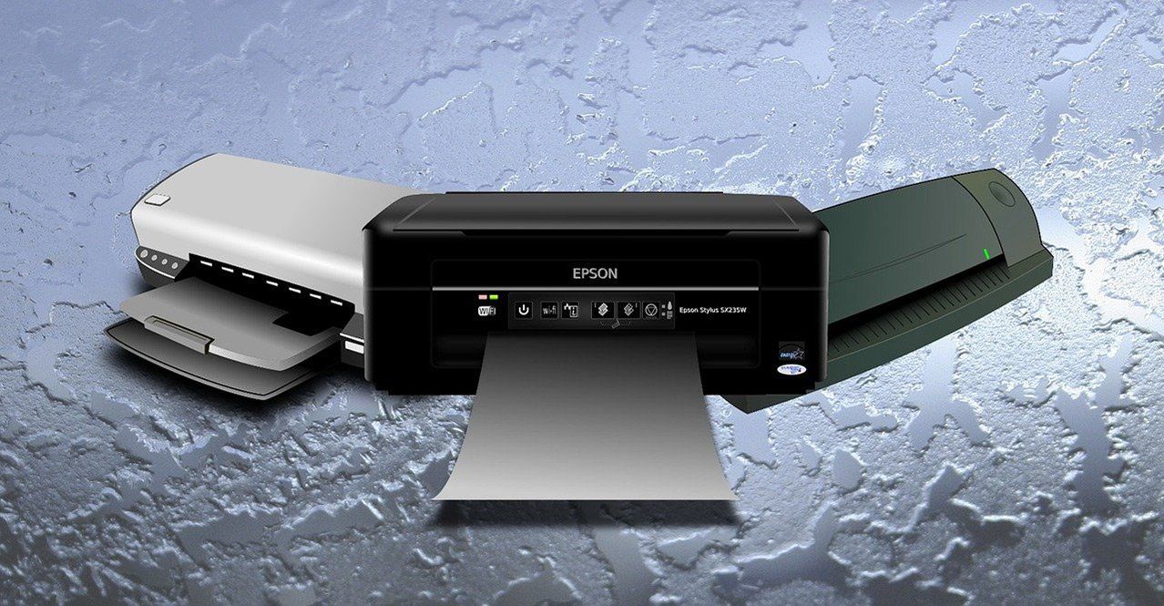
The alternative to an electronic proof is to send a physical printed proof, but anything short of an actual press proof created on a printing press with printer’s ink, is equally problematic. Good quality color proofs are still made on some digital device using Cyan/Magenta/Yellow/Black (CMYK) toner not ink.
Again, the problem of correctly rendering a PMS color in CMYK toner is as limited as rendering that color in Red Green Blue light. Furthermore, a printed proof is still dependent on the quality and calibration of each proofing printer, and finally, toner and ink are as dissimilar as light and ink.
Imagine taking the cushion from your couch to Home Depot and asking the clerk to mix a quart of paint that is the exact color of your couch. The cushion is colorized with textile dyes, and the paint gets its tonal variety from a completely different set of pigments. Even if you knew exactly what textile dyes created the color of the couch, it would still be impossible to exactly match that color using paint pigments. In the same way, luminescent color, toner, and printer’s ink colors all have their own unique properties. Expecting them to perfectly match each other is as unlikely as matching the paint to the couch.
Therefore, the usefulness of either an electronic proof or a printed laser proof to represent PMS colors is very unreliable. The only reliable alternative is an ink draw-down. These are made by ink suppliers, using printer’s ink, in a modified printing press. For best results the draw-down should be done on the actual paper you intend to use in your final print job because the color, texture and finish of the paper you use can affect the final color of the ink. Ink after all, is translucent and the color of the paper will show through the ink. (Blue ink on a bright yellow paper will appear to be green).
Additionally, there are many different colors of white: cool whites lean to the blue side of the spectrum and warm whites lean toward the yellow side of the spectrum and there are natural whites, that are slightly more ivory. Printing the same ink on all these different substrates will yield noticeably different results, so try to do ink draw-downs on the actual paper to be used in the print job to best reflect what the customer will get in their finished product.
Ink draw-downs are rarely used to proof PMS colors because they take several days to create, and they add cost to a project, but they are the most accurate representation of a PMS color. If color is critical to your project, then I advise that you build a little more time and money into the project and ask your printer to provide ink draw-downs for every PMS color used in your project.
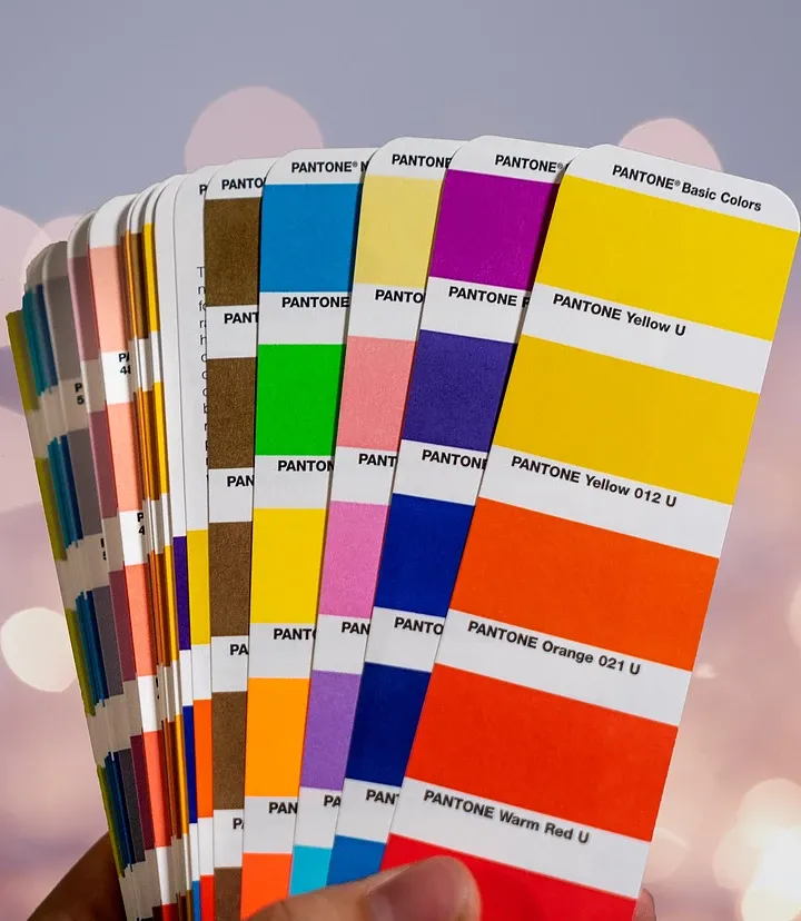
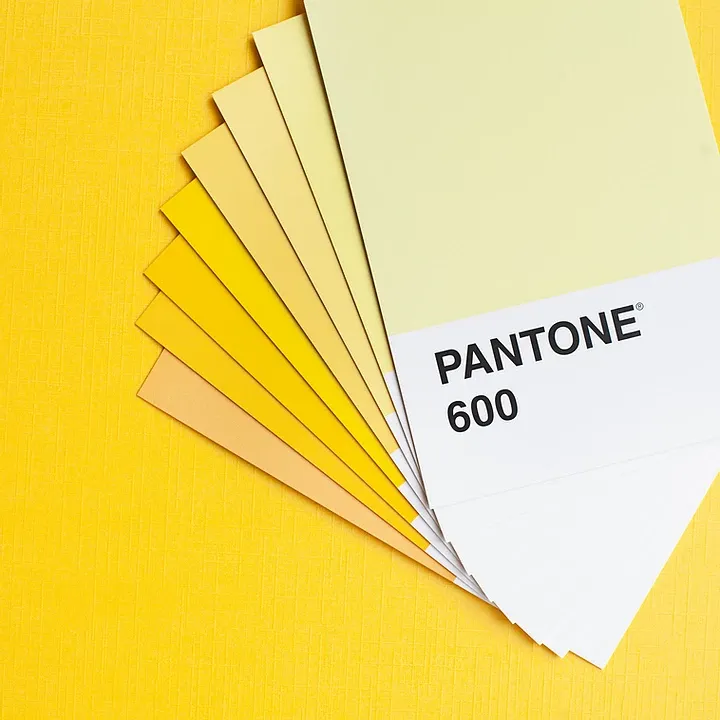
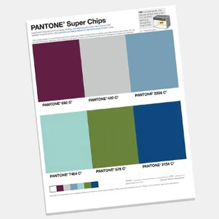
The only other thing you can do besides requesting ink draw-downs is to purchase your own PMS tools and use them to show your client what the color will look like in the finished document. If you use traditional fan out PMS books, this will require that you and your client meet face to face. However, if your client is too far away, you could purchase PMS tools that have perforated chips of each color built into the pages, so you can take the appropriate chip out of the PMS book and attach them to your Epson proof to contrast the actual PMS color to the proof color. However, this option is still limited because of the color of the paper, as noted above.
If you’re responsible for many designs and color precision is part of your job, then having your own PMS books will save you time and money and will be an essential tool in your business. But be careful where you go to get these books.
When I first got into the printing business, I went into a store that handled art supplies and books in general and asked a salesperson where to find the PMS books. The young man, stopped in his tracks, looked a little embarrassed, and directed me to the self-help books for women, on the other side of the store. I turned a few shades of crimson and sheepishly explained, that I was looking for color matching tools.
To avoid this embarrassment, don’t ask for PMS books, ask for the Pantone Matching System, or better yet, just buy your tools from the Pantone website and save yourself the hassle.
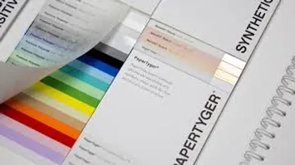
Paper manufactures create swatch books for each of their unique product lines. You can get these free swatch books from any paper distributor and they can be a helpful resource to have on hand… but there is a down-side.

Let me help you market your services in the middle of this terrible pandemic.

A finished printed product must be fully defined at the beginning of the projects. Even somethings as simple as an envelope, a fold-over business card, or a booklet may have finishing issues that need to be considered and included in the design and preparation of the art.

Here is an effective way to bring the right kind of customers to you instead of you trying to beat their doors down.
Carbonless forms are an essential part of many businesses and they can be a great source for profitable repeat business, but there’s a catch.
If you’re like most people you want to save money on office expenses, wherever you can, so I have a few startling statistics to help raise your awareness and possibly motivate you to change some expensive habits.
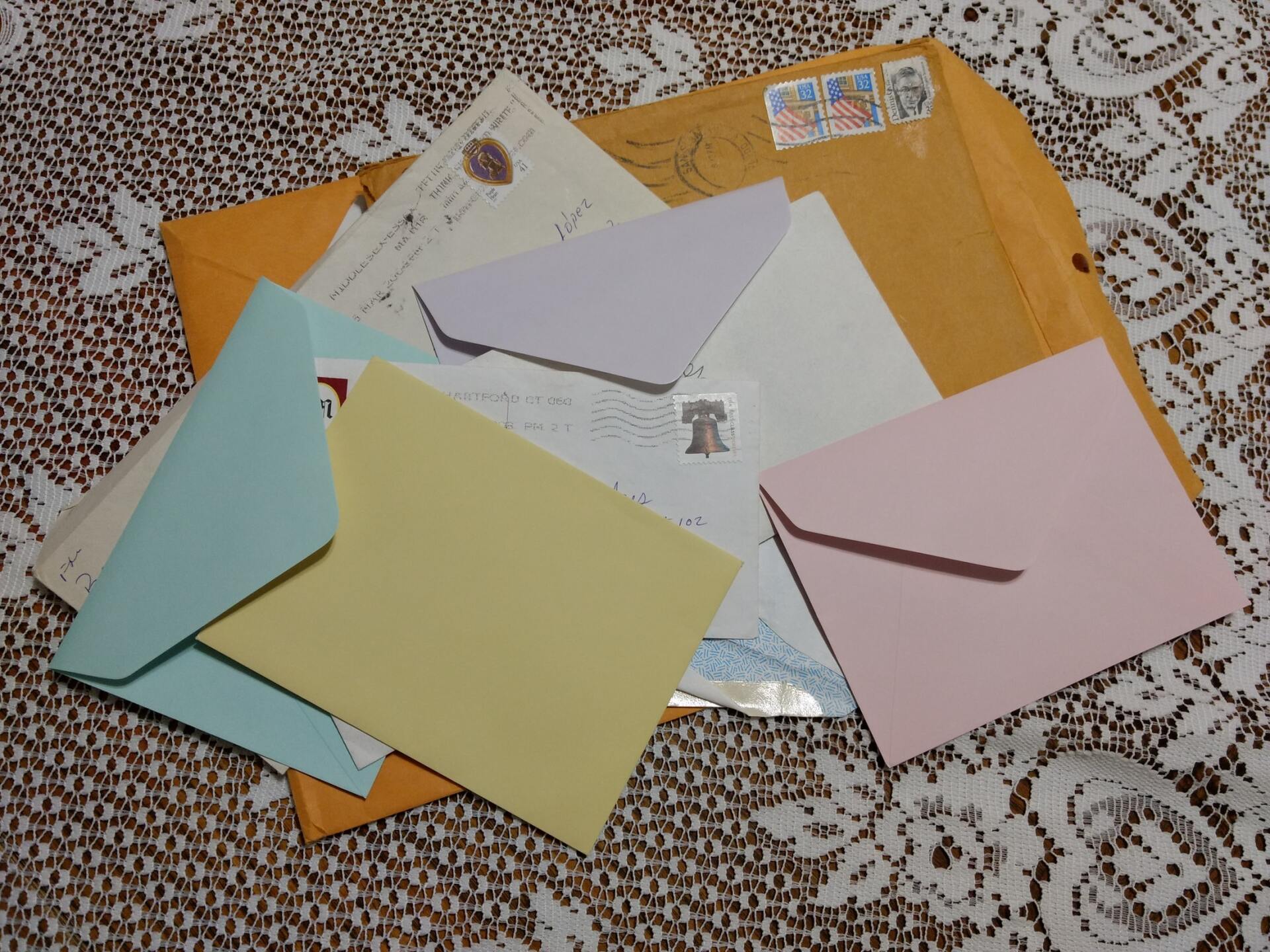
Have you ever noticed that when you go to the internet to find an envelope to fill a specific need that there are hundreds of “custom” envelopes but never the exact one you’re looking for?
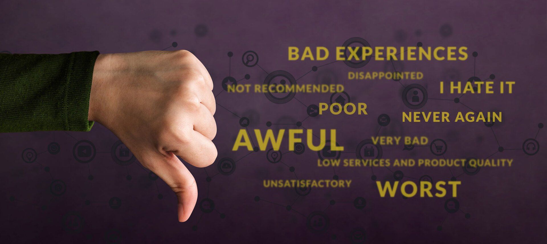
Horrible customer service is all around us! With all these examples, it can be helpful to analyze what specifically makes an experience bad (or good) so we can learn from our own personal experiences.

Are you shrinking back from every challenge or charging ahead with boldness?

For some people a TO-DO list is like a ball and chain holding them back from their full potential, and making them feel like they’re completely ineffective.